| Statistics Toolbox | |
Scatter Plots
A scatter plot is a simple plot of one variable against another. The MATLAB plot and scatter functions can produce scatter plots. The MATLAB plotmatrix function can produce a matrix of such plots showing the relationship between several pairs of variables.
The Statistics Toolbox adds functions that produce grouped versions of these plots. These are useful for determining whether the values of two variables or the relationship between those variables is the same in each group.
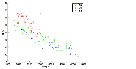
Suppose we want to examine the weight and mileage of cars from three different model years.
This shows that not only is there a strong relationship between the weight of a car and its mileage, but also that newer cars tend to be lighter and have better gas mileage than older cars.
(The default arguments for gscatter produce a scatter plot with the different groups shown with the same symbol but different colors. The last two arguments above request that all groups be shown in default colors and with different symbols.)
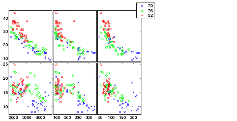
The carsmall data set contains other variables that describe different aspects of cars. We can examine several of them in a single display by creating a grouped plot matrix.
xvars = [Weight Displacement Horsepower];
yvars = [MPG Acceleration];
gplotmatrix(xvars,yvars,Model_Year,'','xos')
The upper right subplot displays MPG against Horsepower, and shows that over the years the horsepower of the cars has decreased but the gas mileage has improved.
The gplotmatrix function can also graph all pairs from a single list of variables, along with histograms for each variable. See Multivariate Analysis of Variance (MANOVA).
| | Empirical Cumulative Distribution Function (CDF) | Statistical Process Control | |