| Statistics Toolbox | |
Syntax
gscatter(x,y,g)
gscatter(x,y,g,'clr','sym',siz)
gscatter(x,y,g,'clr','sym',siz,'doleg')
gscatter(x,y,g,'clr','sym',siz,'doleg','xnam','ynam')
h = gscatter(...)
Description
gscatter(x,y,g)
creates a scatter plot of x and y, grouped by g, where x and y are vectors with the same size and g can be a vector, string array, or cell array of strings. Points with the same value of g are placed in the same group, and appear on the graph with the same marker and color. Alternatively, g can be a cell array containing several grouping variables (such as {G1 G2 G3}); in that case, observations are in the same group if they have common values of all grouping variables.
gscatter(x,y,g,' specifies the color, marker type, and size for each group. clr','sym',siz)
'clr' is a string array of colors recognized by the plot function. The default is 'clr' = 'bgrcmyk'. 'sym' is a string array of symbols recognized by the plot command, with the default value '.'. siz is a vector of sizes, with the default determined by the 'defaultlinemarkersize' property. If you do not specify enough values for all groups, gscatter cycles through the specified values as needed.
gscatter(x,y,g,' controls whether a legend is displayed on the graph (clr','sym',siz,'doleg')
'doleg' = 'on', the default) or not ('doleg' = 'off').
gscatter(x,y,g,' specifies the name to use for the x-axis and y-axis labels. If the clr','sym',siz,'doleg','xnam','ynam')
x and y inputs are simple variable names and xnam and ynam are omitted, gscatter labels the axes with the variable names.
h = gscatter(...)
returns an array of handles to the lines on the graph.
Example
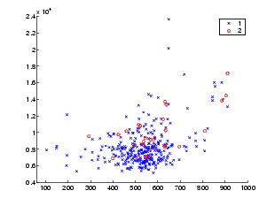
Load the cities data and look at the relationship between the ratings for climate (first column) and housing (second column) grouped by city size. We'll also specify the colors and plotting symbols.
See Also
gplotmatrix, grpstats, scatter
| | grpstats | harmmean | |