| Statistics Toolbox | |
Quantile-Quantile Plots
A quantile-quantile plot is useful for determining whether two samples come from the same distribution (whether normally distributed or not).
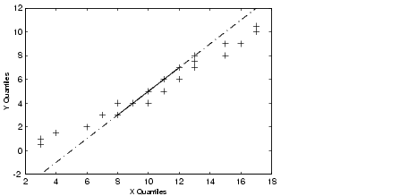
The example shows a quantile-quantile plot of two samples from a Poisson distribution.
Even though the parameters and sample sizes are different, the straight line relationship shows that the two samples come from the same distribution.
Like the normal probability plot, the quantile-quantile plot has three graphical elements. The pluses are the quantiles of each sample. By default the number of pluses is the number of data values in the smaller sample. The solid line joins the 25th and 75th percentiles of the samples. The dashed line extends the solid line to the extent of the sample.
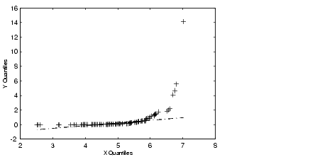
The example below shows what happens when the underlying distributions are not the same.
These samples clearly are not from the same distribution.
It is incorrect to interpret a linear plot as a guarantee that the two samples come from the same distribution. But, for assessing the validity of a statistical procedure that depends on the two samples coming from the same distribution (e.g., ANOVA), a linear quantile-quantile plot should be sufficient.
| | Normal Probability Plots | Weibull Probability Plots | |