| Statistics Toolbox | |
Normal Probability Plots
A normal probability plot is a useful graph for assessing whether data comes from a normal distribution. Many statistical procedures make the assumption that the underlying distribution of the data is normal, so this plot can provide some assurance that the assumption of normality is not being violated, or provide an early warning of a problem with your assumptions.
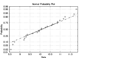
This example shows a typical normal probability plot.
The plot has three graphical elements. The plus signs show the empirical probability versus the data value for each point in the sample. The solid line connects the 25th and 75th percentiles of the data and represents a robust linear fit (i.e., insensitive to the extremes of the sample). The dashed line extends the solid line to the ends of the sample.
The scale of the y-axis is not uniform. The y-axis values are probabilities and, as such, go from zero to one. The distance between the tick marks on the y-axis matches the distance between the quantiles of a normal distribution. The quantiles are close together near the median (probability = 0.5) and stretch out symmetrically moving away from the median. Compare the vertical distance from the bottom of the plot to the probability 0.25 with the distance from 0.25 to 0.50. Similarly, compare the distance from the top of the plot to the probability 0.75 with the distance from 0.75 to 0.50.
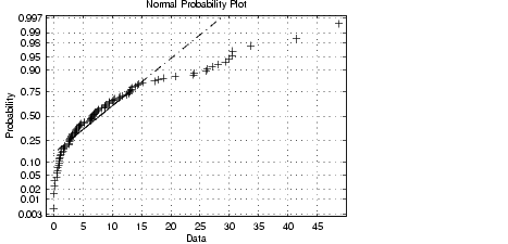
If all the data points fall near the line, the assumption of normality is reasonable. But, if the data is nonnormal, the plus signs may follow a curve, as in the example using exponential data below.
This plot is clear evidence that the underlying distribution is not normal.
| | Distribution Plots | Quantile-Quantile Plots | |