| Statistics Toolbox | |
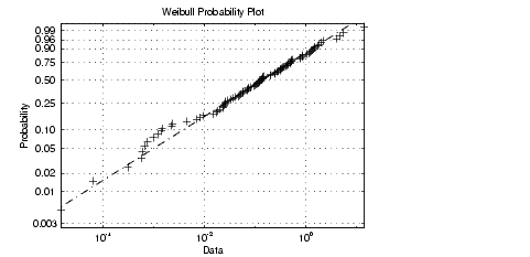
Weibull Probability Plots
A Weibull probability plot is a useful graph for assessing whether data comes from a Weibull distribution. Many reliability analyses make the assumption that the underlying distribution of the lifetimes is Weibull, so this plot can provide some assurance that this assumption is not being violated, or provide an early warning of a problem with your assumptions.
The scale of the y-axis is not uniform. The y-axis values are probabilities and, as such, go from zero to one. The distance between the tick marks on the y-axis matches the distance between the quantiles of a Weibull distribution.
If the data points (pluses) fall near the line, the assumption that the data comes from a Weibull distribution is reasonable.
This example shows a typical Weibull probability plot.
| | Quantile-Quantile Plots | Empirical Cumulative Distribution Function (CDF) | |