| Statistics Toolbox | |
Example: Hypothesis Testing
This example uses the gasoline price data in gas.mat. There are two samples of 20 observed gas prices for the months of January and February, 1993.
As a first step, you may want to test whether the samples from each month follow a normal distribution. As each sample is relatively small, you might choose to perform a Lilliefors test (rather than a Jarque-Bera test):
The result of the hypothesis test is a Boolean value that is 0 when you do not reject the null hypothesis, and 1 when you do reject that hypothesis. In each case, there is no need to reject the null hypothesis that the samples have a normal distribution.
Suppose it is historically true that the standard deviation of gas prices at gas stations around Massachusetts is four cents a gallon. The Z-test is a procedure for testing the null hypothesis that the average price of a gallon of gas in January (price1) is $1.15.
The Boolean output is h = 0, so you do not reject the null hypothesis.
The result suggests that $1.15 is reasonable. The 95% confidence interval [1.1340 1.1690] neatly brackets $1.15.
What about February? Try a t-test with price2. Now you are not assuming that you know the standard deviation in price.
With the Boolean result h = 1, you can reject the null hypothesis at the default significance level, 0.05.
It looks like $1.15 is not a reasonable estimate of the gasoline price in February. The low end of the 95% confidence interval is greater than 1.15.
The function ttest2 allows you to compare the means of the two data samples.
The confidence interval (ci above) indicates that gasoline prices were between one and six cents lower in January than February.
If the two samples were not normally distributed but had similar shape, it would have been more appropriate to use the nonparametric rank sum test in place of the t-test. We can still use the rank sum test with normally distributed data, but it is less powerful than the t-test.
As might be expected, the rank sum test leads to the same conclusion but it is less sensitive to the difference between samples (higher p-value).
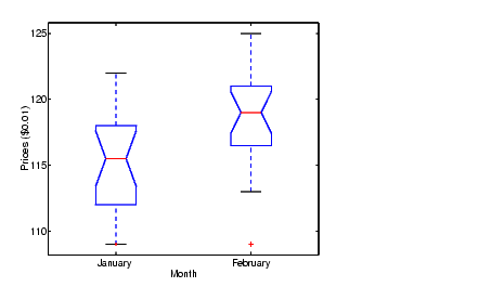
The box plot below gives the same conclusion graphically. Note that the notches have little, if any, overlap. Refer to Statistical Plots for more information about box plots.
boxplot(prices,1)
set(gca,'XtickLabel',str2mat('January','February'))
xlabel('Month')
ylabel('Prices ($0.01)')
| | Hypothesis Test Assumptions | Available Hypothesis Tests | |