| Graphics | |
Adding Plots of Basic Statistics to Graphs
The MATLAB Data Statistics tool:
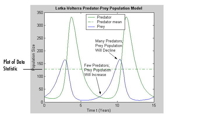
For example, the following figure includes a plot of the mean of the Predator y-data.
The following sections provide more information about using the Data Statistics tool:
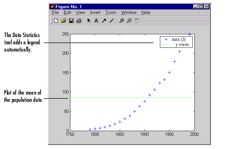
Example - Plotting the Mean of a Data Set
To add a plot of the mean of a data set to a graph:
Using a Legend with Data Statistics
When you activate the Data Statistics tool, it calculates statistics for the plotted data and automatically adds a legend to the graph, if the graph doesn't already have one.
Initially, the legend only includes entries for the data sets plotted in the graph. In the legend, each data set is identified by its tag. (A tag is a user-defined text string that can be associated with any graphics object. For information about creating tags, see Identifying Objects in a Graph.) If there are data sets in the graph that do not have tags, the Data Statistics tool creates a label for them, using data 1 to identify the first plot, data 2 to identify the second plot, and so on.
When you add a plot of one or more statistics to the graph, the Data Statistics tool adds an entry in the legend for the new plot. The Data Statistics tool assigns the plotted statistic a descriptive name that identifies it in the legend. In the example, the plotted statistic has the name y mean in the legend.
Formatting Plots of Data Statistics
The Data Statistics tool uses color and line style to distinguish the plots of statistics from the other plots in a graph. However, like any other plot in a graph, you can change these characteristics.
To modify the properties of a plotted statistic:
Statistics Plotted by the Data Statistics Tool
| Note You can only use the Data Statistics tool to generate statistics for two-dimensional data (vectors and matrices). |
The following table lists the statistics calculated by the Data Statistics tool. The table includes the name of the MATLAB function used to calculate the statistic. For more information about these statistical functions, see the "Basic Data Analysis Functions" in the "Data Analysis and Statistics" chapter.
| Statistic |
Description |
MATLAB Function |
| Maximum |
The largest value in the data set |
max |
| Minimum |
The smallest value in the data set |
min |
| Mean |
The average of all the values in the data set |
mean |
| Median |
The middle value in the data set |
median |
| Range |
The interval between the lowest value and the highest value in the data set. The Data Statistic tool does not plot the range statistic. |
n/a |
| Standard deviation |
A measure characterizing the amount of variation among the values in the data set Note: The Data Statistics tool uses two lines to plot the standard deviation in a graph. The lines represent the boundaries of one standard deviation on either side of the mean of the data set. |
std |
Automatic Updating of Statistics
If you have the Data Statistics tool displayed and you change the x-data or y-data of a plot, the Data Statistics tool automatically regenerates the statistics for that plot.
Viewing Statistics for Multiple Plots
The Data Statistics tool calculates basic statistics for every 2-D plot in a graph, but displays the statistics for only one plot at time.
To view the statistics for a particular plot in a graph:
data1 to identify the first plot, data2 to identify the
second plot, and so on.
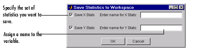
Saving Statistics to the MATLAB Workspace
To save the statistics generated by the Data Statistics tool to the MATLAB workspace, follow this procedure:
The Data Statistics tool saves each set of statistics in a structure. For example, if you save the set of statistics on the x-data in the census in the variable census_dates, the contents of the structure looks like this.
| | Adding Arrows and Lines to Graphs | Displaying Bit-Mapped Images | |