| Statistics Toolbox | |
X-bar chart for Statistical Process Control
Syntax
Description
xbarplot(DATA)
displays an x-bar chart of the grouped responses in DATA. The rows of DATA contain replicate observations taken at a given time, and must be in time order. The graph contains the sample mean  for each group, a center line at the average
  value, and upper and lower control limits. The limits are placed at a three-sigma distance on either side of the center line, where sigma is an estimate of the standard deviation of
  . If the process is in control, fewer than 3 out of 1000 observations would be expected to fall outside the control limits by random chance. So if you observe points outside the limits, you can take this as evidence that the process is not in control.
xbarplot(DATA,conf)
allows control of the confidence level of the upper and lower plotted confidence limits. The default conf = 0.9973 produces three-sigma limits.
To get k-sigma limits, use the expression 1-2*(1-normcdf(k)). For example, the correct conf value for 2-sigma limits is 0.9545, as shown below.
xbarplot(DATA,conf,specs)
plots the specification limits in the two element vector specs.
xbarplot(DATA,conf,specs,' specifies how sigmaest')
xbarplot should estimate the standard deviation. Acceptable values are:
's' - use the average of the group standard deviations (default)
'v' - use the square root of a pooled variance estimate
'r' - use the average range with each group; requires 25 or fewer observations per group
[outlier,h] = xbarplot(DATA,conf,specs)
returns outlier, a vector of indices to the rows where the mean of DATA is out of control, and h, a vector of handles to the plotted lines.
Example
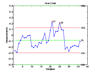
Plot an x-bar chart of measurements on newly machined parts, taken at one hour intervals for 36 hours. Each row of the runout matrix contains the measurements for four parts chosen at random. The values indicate, in thousandths of an inch, the amount the part radius differs from the target radius.
The points in groups 21 and 25 are out of control, so the mean in those groups was higher than would be expected by random chance alone. There is evidence that the process was not in control when those measurements were collected.
See Also
capaplot, histfit, ewmaplot, schart
| | x2fx | zscore | |