| Statistics Toolbox | |
Xbar Charts
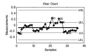
Xbar charts are a plot of the average of a sample of a process taken at regular intervals. Suppose we are manufacturing pistons to a tolerance of 0.5 thousandths of an inch. We measure the runout (deviation from circularity in thousandths of an inch) at four points on each piston.
The lines at the bottom and the top of the plot show the process specifications. The central line is the average runout over all the pistons. The two lines flanking the center line are the 99% statistical control limits. By chance only one measurement in 100 should fall outside these lines. We can see that even in this small run of 36 parts, there are several points outside the boundaries (labeled by their observation numbers). This is an indication that the process mean is not in statistical control. This might not be of much concern in practice, since all the parts are well within specification.
| | Control Charts | S Charts | |