| Using Simulink | |
Control Types
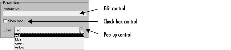
Simulink enables you to choose how parameter values are entered or selected. You can create three styles of controls: edit fields, check boxes, and pop-up controls. For example, this figure shows the parameter area of a mask dialog box that uses all three styles of controls (with the pop-up control open).
Edit Control
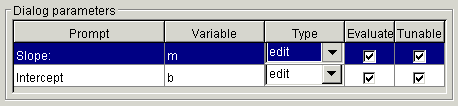
An edit field enables the user to enter a parameter value by typing it into a field. This figure shows how the prompt for the sample edit control was defined.
The value of the variable associated with the parameter is determined by the Evaluate option.
| Evaluate |
Value |
| On |
The result of evaluating the expression entered in the field |
| Off |
The actual string entered in the field |
Check Box Control
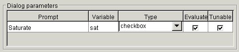
A check box enables the user to choose between two alternatives by selecting or deselecting a check box. This figure shows how the sample check box control is defined.
The value of the variable associated with the parameter depends on whether the Evaluate option is selected.
| Control State |
Evaluated Value |
Literal Value |
| Checked |
1 |
'on' |
| Unchecked |
0 |
'off' |
Pop-Up Control
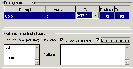
A pop-up enables the user to choose a parameter value from a list of possible values. Specify the values in the Popups field on the Parameters pane (see Popups). The following example shows a pop-up parameter.
The value of the variable associated with the parameter (Color) depends on the item selected from the pop-up list and whether the Evaluate option is checked (on).
Changing Default Values for Mask Parameters in a Library
To change default parameter values in a masked library block, follow these steps:
When the block is copied into a model and opened, the default values appear on the block's dialog box.
For more information, see Working with Block Libraries.
| | The Parameters Pane | The Initialization Pane | |