| Financial Time Series Toolbox | |
Graphs Menu
The Graphs menu displays time series data using the provided graphics functions. Included in the Graphs menu are several types of bar charts (bar, barh, bar3, bar3h), line plot (plot), candle plot (candle), and High-Low plot (highlow). The Graphs menu also provides access to the interactive charting function, chartfts.
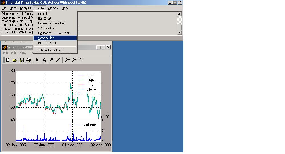
Candle Plot
For example, you can display the candle plot of a set of time series data and invoke the interactive chart on the same data set.
Load the ftsdata.mat data set, and click on the window that displays the Whirlpool (WHR) time series data to make it active (current). From the main window choose the Graphs menu and Candle Plot menu item.
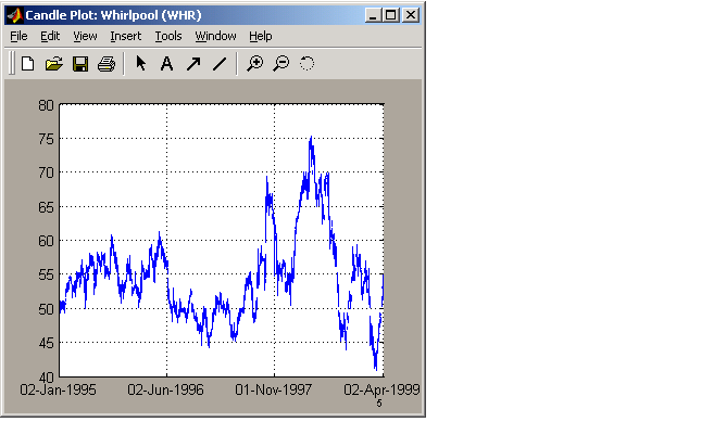
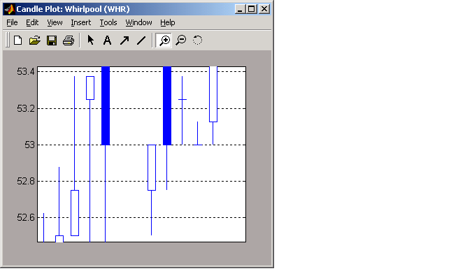
This does not look much like a candle plot because there are too many data points in the data set. All the candles are too compressed for effective viewing. However, when you zoom into a region of this plot, the candles become apparent.
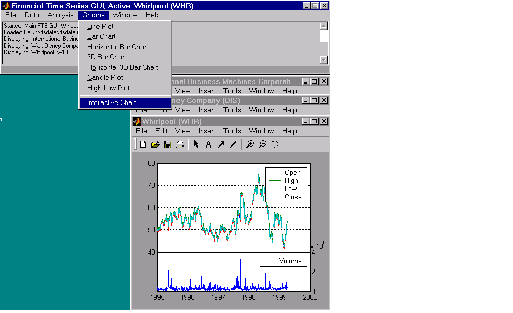
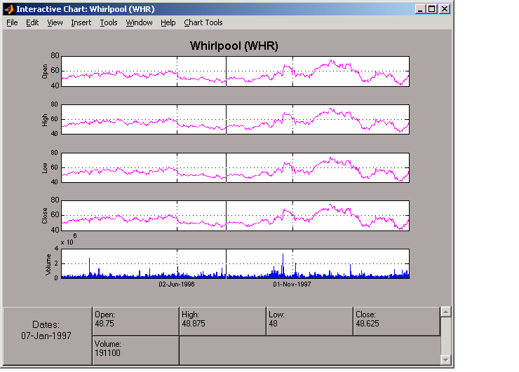
Interactive Chart
To create an interactive chart (chartfts) on the Whirlpool data, click on the window that displays the Whirlpool (WHR) data to make it active (current). Then, go to the Graphs menu and choose Interactive Chart.
The chart that results is shown below.
You can use this interactive chart as if you had invoked it with the chartfts command from the MATLAB command line. For a tutorial on the use of chartfts, see Visualizing Financial Time Series Objects.
| | Analysis Menu | Saving Time Series Data | |