| Financial Toolbox | |
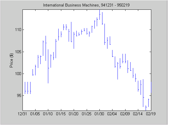
High-Low-Close Chart Example
First load the data and set up matrix dimensions. load and size are standard MATLAB functions.
Open a figure window for the chart. Use the Financial Toolbox highlow function to plot high, low, and close prices for the last 50 trading days in the data file.
Add labels and title, and set axes with standard MATLAB functions. Use the Financial Toolbox dateaxis function to provide dates for the x-axis ticks.
xlabel('');
ylabel('Price ($)');
title('International Business Machines, 941231 - 950219');
axis([0 50 -inf inf]);
dateaxis('x',6,'31-Dec-1994')
MATLAB produces a figure similar to this. The plotted data and axes you see may differ. Viewed online, the high-low-close bars are blue.
| | Charting Financial Data | Bollinger Chart Example | |