| Statistics Toolbox | |
Quantile-quantile plot of two samples
Syntax
Description
qqplot(X)
displays a quantile-quantile plot of the sample quantiles of X versus theoretical quantiles from a normal distribution. If the distribution of X is normal, the plot will be close to linear.
qqplot(X,Y)
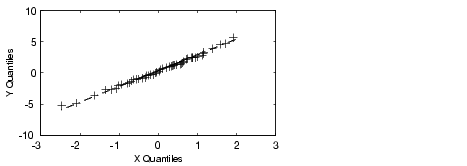
displays a quantile-quantile plot of two samples. If the samples do come from the same distribution, the plot will be linear.
For matrix X and Y, qqplot displays a separate line for each pair of columns. The plotted quantiles are the quantiles of the smaller dataset.
The plot has the sample data displayed with the plot symbol '+'. Superimposed on the plot is a line joining the first and third quartiles of each distribution (this is a robust linear fit of the order statistics of the two samples). This line is extrapolated out to the ends of the sample to help evaluate the linearity of the data.
Use qqplot(X,Y,pvec) to specify the quantiles in the vector pvec.
h = qqplot(X,Y,pvec)
returns handles to the lines in h.
Examples
Generate two normal samples with different means and standard deviations. Then make a quantile-quantile plot of the two samples.
See Also
normplot
| | procrustes | random | |